This I have decided will be my final edit.
I am tempted to print this into a book but I do not have the time to do so.
.JPG) |
| Moblie phones. |
.JPG) |
| Isolation. |
.JPG) |
| Sales |
.JPG) |
| Sexy/Hottie. |
.JPG) |
| Benches |
.JPG) |
| Dogs |
.JPG) |
| Fashion. |
.JPG) |
| Age. |
.JPG) |
| 'Chavs.' |
.JPG) |
| Instruments |
.jpg) |
| There must be at least three images here. Yet there is little of actual people, apart from the little green man. |
.jpg) |
| The focus on this could be better. Yet, I quite like it. |
.jpg) |
| These shops are nicely in focus, shame the same can't be said for the people here. Something about these old people are kind of creepy. |
.jpg) |
| "You are always on that phone, are you even listening to me?" |
.jpg) |
| Old man, mobile phone, it's almost ironic |
.jpg) |
| I wonder if I subconsciously lined this almost stereotypical 'delinquents' up with the bin... Hmm... |
.jpg) |
| I really wish I didn't catch the bollard in the foreground. It would have been a fantastic photograph otherwise. |
.jpg) |
| He seems uninterested in the world. Apart from what is potentially a mobile phone there is very little indication of he is doing or even what is going on in his head. |
.jpg) |
| This guy seems to be held up against the wind. |
.jpg) |
| I find that this overlay is too faint, still interesting though. |
.jpg) |
| Quite soft with regard to focus but I like the way the angles have overlaid. |
.jpg) |
| Out of focus and the crop is a bit odd. |
.jpg) |
| This feels very staged. Almost awkward. |
.jpg) |
| Totally out of focus. |
.jpg) |
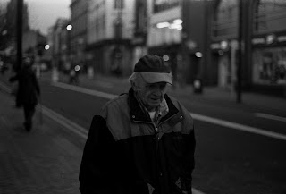
| This gentleman seems to be in a little bit of pain, almost like his shoes are rubbing or he has a stuff knee. |
.jpg) |
| The lady in the hat seems bemused, like she is telling a private joke. |
.jpg) |
| This would have been quite a good photo just as long as it was in focus. |
.jpg) |
| This isn't exactly street photography but I do like the water stains where I got the drying wrong. |
.jpg) |
| I like how the wayfarer glasses add a sense of glamor to the image. |
.jpg) |
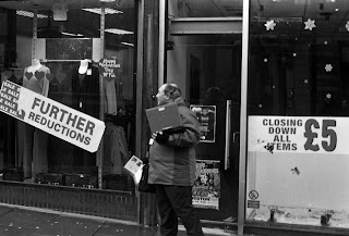
| Closing down? Further reductions? Yet this man is still selling. |
.jpg) |
| He seems almost jovial in his posture, as if he was dancing in a minstrel like fashion. |
.jpg) |
| 'Wait' is a very interesting word. The woman here appears shocked that she has to wait, almost as if it's an affront to her personally. |
.jpg) |
| This guy had the best idea on this day it was really windy and cold, hot soup was genius. This image I found was actually fairly boring. |
.jpg) |
| This hoodie is a little bit insane, insane enough that it is amazing. |
.jpg) |
| The solidity and harshness of this image adds to the isolation and solitude of the image. |
.jpg) |
| I really quite enjoy the framing on this one, I like how the steam adds atmosphere. |
.jpg) |
| This is messier than some of the other overlaid prints, yet i find the central figure intriguing. |
.jpg) |
| This is out of focus, but I think this still has a certain charm. A certain artistic quality. |
.jpg) |
| There is something about the stern man smoking that intrigues me. |
.jpg) |
| I'm not sure what it is about this image that I like, Yet I like it a lot. |
.jpg) |
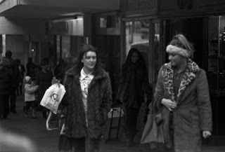
| Something about this just doesn't feel right. |
.jpg) |
| Redefining "Giving Evils" since 2012. |
.jpg) |
| This man seems a very proud man. I like how he is just standing proud and watching the world go by. |
.jpg) |
| I also find the geometry in this interesting. |
.jpg) |
| My action figures don't really count as street photography do they? |
.jpg) |
| I'm not totally sure why but the word 'whimsical' pops into my head whilst I am viewing this. I also like how the woman's back lines up with the accordion |
.jpg) |
| I like the irony of overlaying the bank and a bargain store |
.jpg) |
| The blurry trees and statues I think really add something to the street we see here. |
.jpg) |
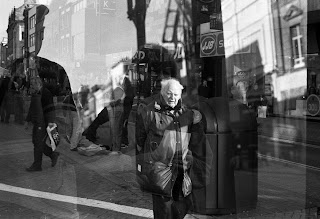
| Shadows and the shadows of men. |
.jpg) |
| I think this one is a little messy but it's quite interesting. |
.jpg) |
| Simultaneous shopping and packing. |
.jpg) |
| I really like the phrase "Bag yourself a hottie." |
.jpg) |
| She seems like she is coming to the end of a long walk. |
.jpg) |
| I didn't realise how I was pointing the camera at this guys crotch..... |
.jpg) |
| The two streets at the same angle is a cool effect. |
.jpg) |
| I like how the musicians in the background are linear in the background. |
.jpg) |
| I don't like how the guy in the middles face is covered. |
.jpg) |
| The irony in this shot cannot be missed, I love it. |
.jpg) |
| The way the road marking have fallen has worked rather well for this image. I also like how there are two dogs being walked here. |
.jpg) |
| This is an interesting combination of photograph overlaid with the geometrical pattern of a closed shutter. |
.jpg) |
| I quite like the gang like stationing of the bikes and the mistiness of the overlay. |
.jpg) |
| The overlay is almost like blurry mist. |
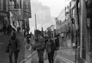.jpg) |
| I wish these were both in line. |
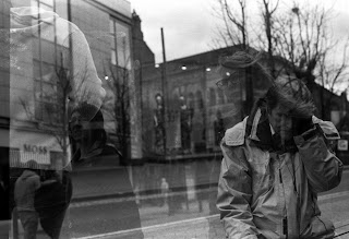.jpg) |
| I like how the shoulders of the two people on the right line up. |
.jpg) |
| The odd angles here make things possibly more interesting. |
.jpg) |
| The woman pushing her own wheelchair is interesting, I also quite like how she is the one out of focus. |
.jpg) |
| I do like the geometrics of this image. |
.jpg) |
| The over lay on this looks a little odd, like it was an error in the processing. I also feel the woman is too centralised. |
.jpg) |
| The crossed angles are really interesting. |
.jpg) |
| I really quite like the ghostly over overlay of the museum and her face. |
.jpg) |
| This is a little bit too cluttered. |
.jpg) |
| There is somethign 'Farmer-esque' about this gentleman, I like it. |
.jpg) |
| I quite like the sale signs in the windows here. |
.jpg) |
| I think I was moving a little too much on this image. |
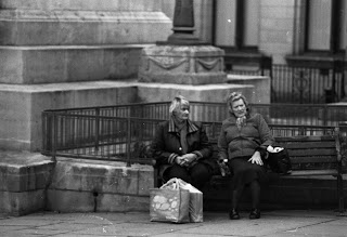.jpg) |
| I think I would title this image "Back in my day" the woman-on-the-right's expression will tell you why. |
.jpg) |
| Far more open than my other images. Yet the geometry and the space appeals to me. |
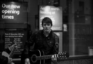.jpg) |
| I like how he is busking in front of a bank, he was also the first person to spot me taking photographs. |
.jpg) |
| I completely missed focus here. |
.jpg) |
| The isolation and appearance that she is crying adds a feeling of desperation to this image. |
.jpg) |
| This living statue is actually really disconcerting, his position is actually quite camp. |
.jpg) |
| I really dislike like dogs, to the point of which I would say that I hate them. Yet the way he is holding this one I find amusing, like he is offering it up to something. |
.jpg) |
| This feels so closed, I wish I had cropped this the other way, with the subject to the left. |
.jpg) |
| This was an odd moment. She had begun to have a small breakdown because was unable to light her cigarette. |
.jpg) |
| It feels like there is no centre, no subject in this image. |
.jpg) |
| The softness of the focus here is what I believe makes this image work. It makes it feel layered somehow. |
.jpg) |
| I think the simplicity of this image is it's strongest asset. An elderly couple holding hands. It feels honest. |
.jpg) |
| I really like the image of Audrey Hepburn in the window and the clearance sign. I also like that the sign behind the gentleman shows he is heading towards a church. |
.jpg) |
| There is too much blurry foreground here. It seems quite distracting. |
.jpg) |
| This is quite dark but I love the between the head crop. |
.jpg) |
| I'm not sure what it is but something of the arrogance in her face appeals to me. |
.jpg) |
| This is a rather dark image, but I find it adds to the idea of isolation and seclusion. |
.jpg) |
| This strikes me that it would be a rather jovial conversation, A sort of meeting of the minds. |